Skip to content

Posts from the ‘Greno’ Category

Typecasting Sebald’s The Rings of Saturn

W.G. Sebald’s books present a number of challenges to book designers, not the least of which is the inclusion of images (some of them deliberately of very poor quality) within his texts. And then there is the challenge to the book jacket designer, who must cope with the fact that there is no identifiable topic to Sebald’s prose and poetic texts.

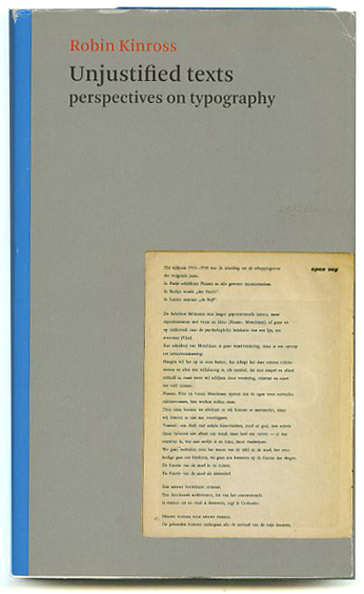
Typographer, author, critic, and editor Robin Kinross addresses these issues in a wonderful essay in his book Unjustified Texts (London: Hyphen Press, 2002). His essay, Judging a Book by its Material Embodiment: A German-English Example (pp. 186-199) opens with some reflections by Theodor Adorno on the commodification (i.e. consumerification) of books in the twentieth century, then proceeds to a brief history of Die Andere Bibliothek, the important series of books edited by Hans Magnus Enzensberger. Sebald’s first three prose works were released as volumes in this series.Founded in 1985 as an idealistic collaboration between the editor Enzensberger and the publisher Franz Greno (who published Sebald’s most exquisite book Nach der Natur in 1988), the series was sold to Eichborn Verlag in 1989, although Greno continued to be in charge of book production.

Kinross praises the production values, the materials, and the attention to details that typify Die Andere Bibliothek, zeroing in on Sebald’s Die Ringe des Saturn. But more importantly, Kinross suggests that Die Andere Bibliothek is committed to the book as object rather than the book as commodity:

The Andere Bibliothek was, and still is, an attempt to publish books of real content in a form that had distinct material quality, and which, in sum, resisted the apparently irresistible processes of commodification.

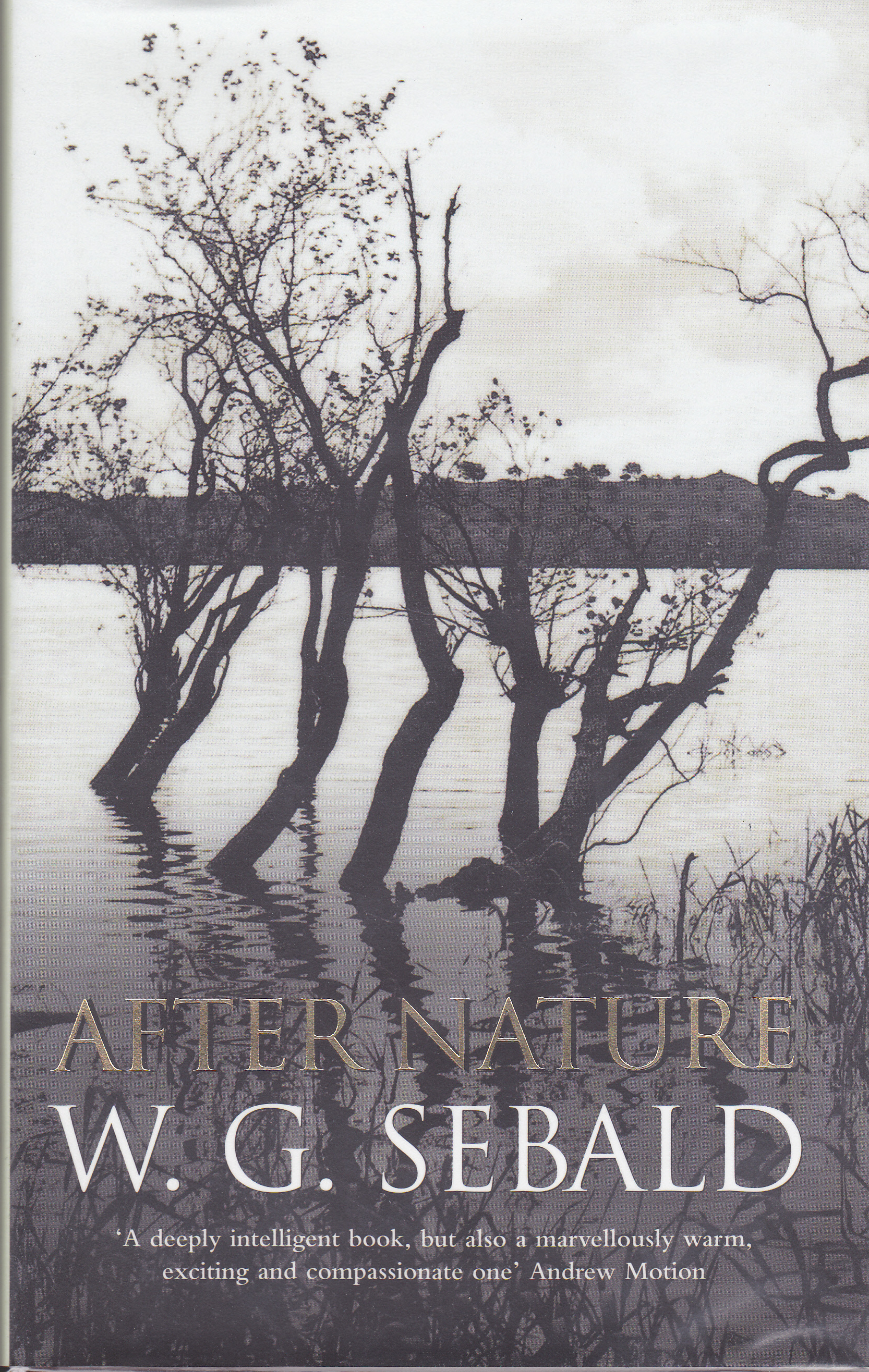
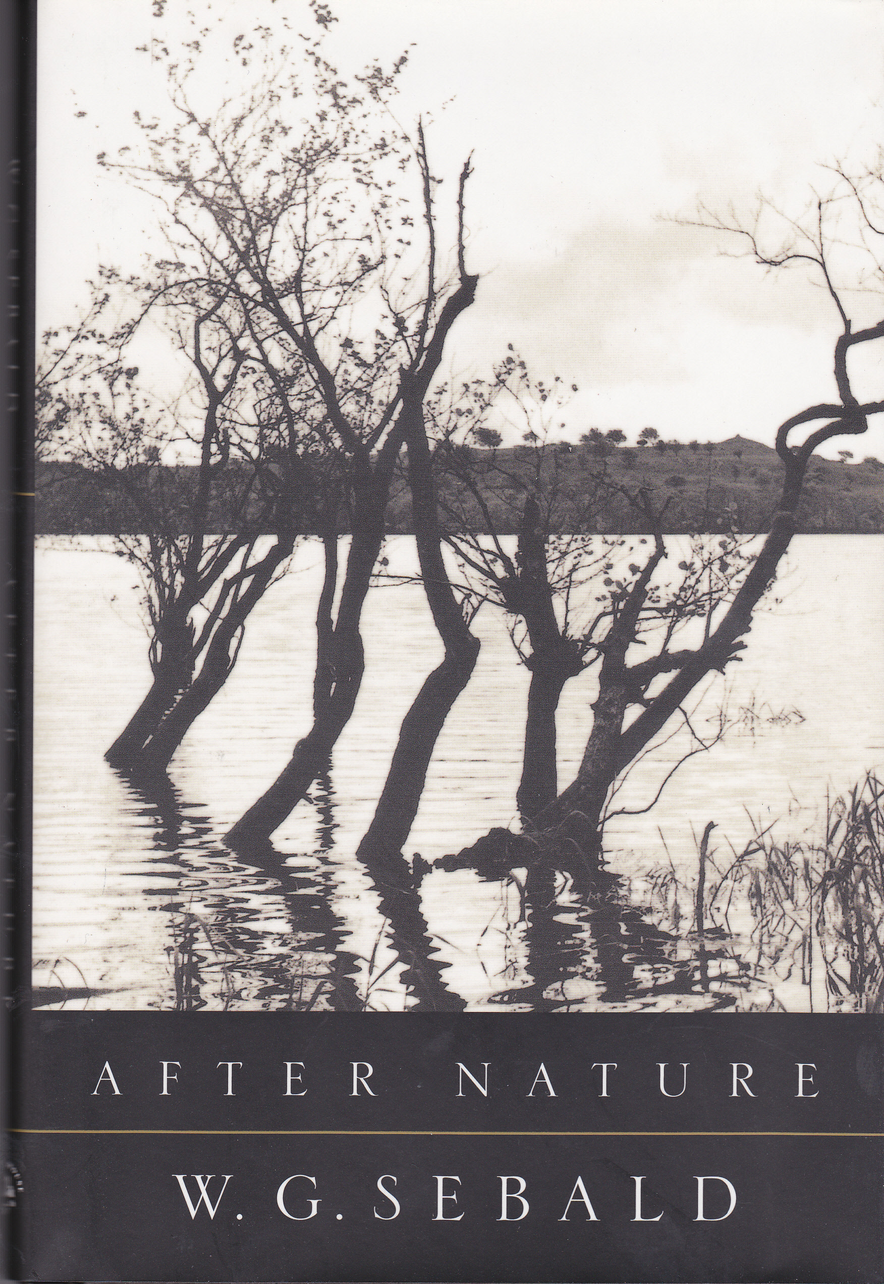
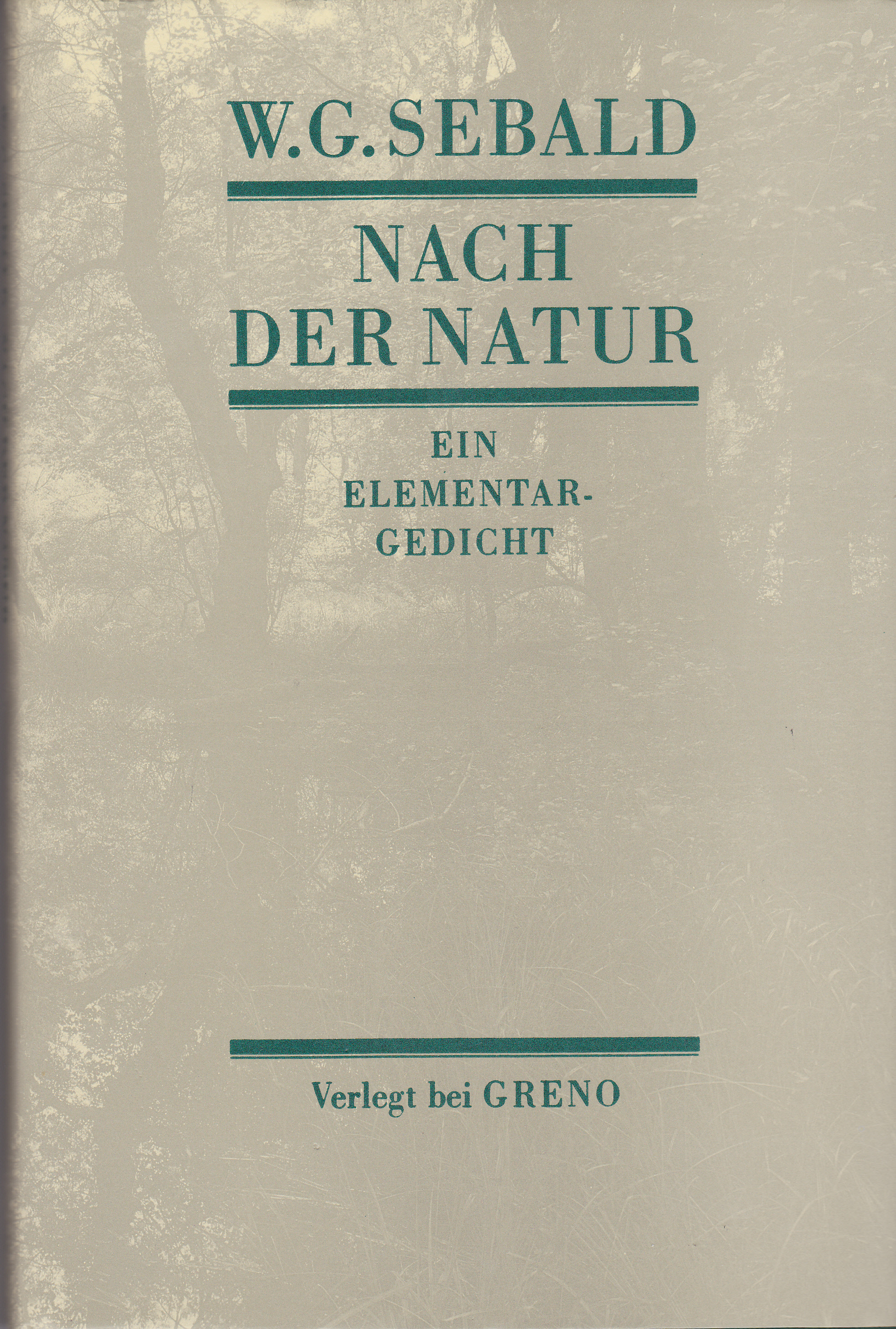
Kinross makes a direct physical and aesthetic comparison between the German edition of Die Ringe des Saturn (1995) and The Rings of Saturn as published in Great Britain by Harvill in 1998. He examines the paper, binding, typography, and other physical characteristics of both books, as well as a comparing the placement Sebald’s photographs in both versions. The bottom line, in Kinross’ mind, is that he Harvill edition “betrays the work,” and in reaching this conclusion he feels that the comparison:

tells us something about present-day literary culture in the two countries [and] something about Sebald’s enterprise as a writer.

Anyone interested in books and book production will enjoy the entirety of Kinross’ book. On topics ranging from Jan Tschichold to the layout of the Dutch telephone directory, Kinross brings an erudite intelligence, a sharp eye, and high standards to the discussion.

Collecting W.G. Sebald’s After Nature

Sebald After Nature British Edition

After Nature, published by Hamish Hamilton

Nach der Natur: Ein Elementargedicht was one of Sebald’s earliest books. It was published in a small, almost luxurious volume by Greno (Nordlingen, Germany) in 1988. Nach der Natur was finally published posthumously in English in 2002 by Hamish Hamilton (Penguin Books), after the critical success of his four major works of prose fiction in the English and American publishing worlds. Obviously aware of how much importance Sebald placed on participating in the translation of his own works into English, the English-language editions include a Publisher’s Note stating that “W.G. Sebald approved a final version of the text before his untimely death.” (Update May 12, 2007.Another Sebald collector has told me that Greno also released a limited special edition of Nach der Natur known as a Vorzugsausgabe.It is bound in leather and has a cloth slipcase, but is neither signed nor numbered.He informs me that Franz Greno told him it was in an edition of 200. )

In English, the volume was called simply After Nature, without the subtitle Ein Elementargedicht, which literally translates as “an elementary poem”. The English language volumes also lack the four double-page photographs by German photographer Thomas Becker, which form a prelude and coda to the volume’s text matter. The American edition by Random House (below) curiously omits the admittedly brief Contents page (there are only three poems), but feels the need to tack on three pages at the end for About the Author, About the Translator, and About the Type.

Sebald After Nature American Edition

Random House issued After Nature in an Advance Uncorrected Proofs version, and it has at least one interesting variant from the final version as published by both Hamish Hamilton and Random House. The text of the middle poem “And if I Remained by the Outermost Sea” begins on page 43 in both English-language versions. In the Advance Uncorrected Proofs version the first six lines read as follows (the italics are mine):

Georg Wilhem Steller
born at Windsheim, in Franconia,
while pursuing his studies
at the University of Halle
repeatedly came across news
docketed (inserted) in journals

In the British edition, lines 5 and 6 read this way:

repeatedly came across
news items in journals

And in the Random House edition, those same lines read:

repeatedly came across news
items in journals

The small typographical admission of uncertainty that appears in the Random House Proofs version opens a window into the translating process. In the original German, the two lines quoted above in English are found on a single line which reads:

auf die in die Intelligenzblatter eingeruchte Nachricht,

Clearly, Sebald (or translator Michael Hamburger) was struggling with Sebald’s reference to the obscure 18th century newspaper the Intelligenzblatter and toyed with the possibility of suggesting that news items read by Steller were “docketed” or “inserted” into a generic “journal”. In the end, simplicity and clarity won out and it was decided to refer to “news items”, dropping any reference at all to the existence of a newspaper, specific or otherwise.

Sebald Nach Natur

The original German publication by Greno is a stunningly beautiful slim volume bound in deep green cloth, with finely printed photographic endpapers of Becker’s photographs. The British first edition, although in unfortunate dull brown boards, feels better designed and more generous that the Random House first edition. It employs the typeface Monotype Perpetua and a larger font size, which provides elegant, bold Roman numerals for the frequent section headings of the three poems. The British version’s thicker, whiter paper gives the poems more gravitas, leaving the American version feeling thin and overly delicate.