Skip to content

Posts from the ‘First editions’ Category

James Wood and W.G. Sebald

from: Brick 59. Photograph of Sebald by Irma Long, circa 1997

On July 10, 1997, scarcely a year after the publication of The Emigrants (his first book to appear in English translation), W.G. Sebald sat down with critic James Wood in New York city for an interview, which appeared the next spring in a relatively obscure literary journal out of Toronto called Brick.   Wood had already come to realize that The Emigrants was a game-changer.  “Walter Benjamin said that all great works found a new genre or dissolve an old one,” Wood wrote in his opening sentence.  “The Emigrants is such a book.”  Wood continued on to praise the book for its “fastidiousness” and the way “it forces the largest abstract questions on us, while never neglecting our hunger for the ordinary.  It is full of this extraordinary, careful detail…”

Wood’s questioning of Sebald dealt with many of the issues that have come to define Sebald: his use of photographs, the intermingling of fact and fiction, the nature of Sebald’s prose, and his approach to narration.  Here’s Sebald on the latter topic:

I think that fiction writing, which does not acknowledge the uncertainty of the narrator himself, is a form of imposture and which I find very, very difficult to take.  Any form of authorial writing, where the narrator sets himself up as stagehand and director and judge and executor in a text, I find somehow unacceptable.  I cannot bear to read books of this kind.

…I’d much rather read autobiographical texts of a Chateaubriand or a Stendhal, that sort of thing…I find there is a degree of realness in it which I can calculate.  Whereas with the novels, I find we are subjected to the rules and laws of fiction to a degree which I find tedious.

Two years later, Wood elaborated on these ideas in his essay “W.G. Sebald’s Uncertainty,” published in his 1999 collection The Broken Estate.  There, Wood discussed both The Emigrants and The Rings of Saturn, emphasizing the way in which facts (including photographs) became fictive in Sebald’s work as a part of Sebald’s strategy of investing “his narration with scrupulous uncertainty.”  For Sebald, “facts are indecipherable, and therefore tragic.”  Quite in opposition to Proust, “in Sebald, we are defined by the terrible abundance of our lacunae.”  Having read The Rings of Saturn, Wood views Sebald’s use of language with even greater clarity.  “Sebald’s language is an extraordinary, almost antiquarian edifice, full of the daintiest lusters.”  The “quality of melodrama and extremism running alongside a soft mutedness” is, Wood thinks, practically “Gothic.”

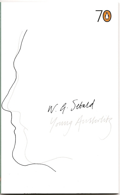
Last month, Wood returned to Sebald again, writing the introduction to Penguin’s tenth anniversary edition of Austerlitz, which he characterizes as a “journey of detection,” though, he warns, “the book really represents the deliberate frustration of detection, the perpetuation of an enigma.”  Sebald noted in his 1997 interview that he was more interested in biography than in fiction and Austerlitz represents his most extended attempt to write a fictional biography on his own terms.  In his introduction, Wood continues to elaborate on the aspects of Sebald that first attracted his attention in 1997, but he lingers on Sebald’s tactic of forcing the reader into Austerlitz’s shoes by strategically withholding information and by layering Austerlitz’s narrative behind his own narrator’s re-telling of Austerlitz’s story.  “What is so delicate is how Sebald makes Austerlitz’s story a broken, recessed enigma, whose meaning the reader must impossibly rescue.”  In the end, Wood says, “a life has been filled in for us but not a self.”

The new Penguin edition is really a reissue of their standard paperback edition of Austerlitz with the insertion of a new twenty-one page essay by James Wood and the addition of a faux gold seal on the front cover.  Nothing else has changed – not even the blurbs on the cover.  But since it does include a new introduction, most collectors will treat it as a new edition and will want the first printing, which Penguin has appropriately marked with a tiny “1” on the copyright page.

Mystery Promotional Copy of Sebald’s Vertigo

Vertigo Softcover ARC

I now own a mildly mysterious copy of W.G. Sebald’s Vertigo as published by New Directions.  An alert reader of this blog noted that elsewhere I had written: “Curiously, Vertigo is the only one of Sebald’s major books for which I have never seen a British or American proof or advanced readers copy offered for sale. I wonder if one even exists.”   He saw just such a title advertised for sale and let me know so that I was able to buy it for my collection.

New Directions published the first American edition of Vertigo sometime in 2000 (the New York Times reviewed it June 11, 2000).  More than a year later, when they finally decided to release a soft cover edition, New Directions seems to have sent out an unknown number of advance promotional copies to promote the forthcoming soft cover version – using copies of the hard cover edition.  They simply took a jacket-less hard cover copy, slapped a small image of the book’s cover and two pre-printed stickers on the front cover, and then stapled a single page from their October newsletter into the front endpaper.  Unfortunately, it probably isn’t possible to know if this copy is from the first or second New Directions printing, because New Directions places information about subsequent printings of hard cover editions on the dust jacket – not in the book itself as most publishers do.  Note that the upper sticker misspells the name of the British publisher Harvill.

The mini-book cover for Vertigo that is pasted onto the promotional copy above presents another – admittedly minor – puzzle.  Semadar Megged’s front cover designs for the hard cover and soft cover editions of Vertigo (shown below) are essentially the same with only minor changes to adjust for the smaller cover area of about three quarters of an inch in both directions.  Although it is closer to the dust jacket of the hard cover edition since it does not reproduce the blurb by Richard Eder that appears in the final design of the soft cover edition, the cover shown above differs from the final designs of both hard cover and soft cover.   If you look closely you will see that the relationship between the text and the photograph of the volcano does not match the final designs and we see a second peak to the left of the spewing volcano.

Vertigo HC Cover
Left: hard coverVertigo PB Cover

Right: soft cover

Sebald’s Selected Poems

Carl Hanser Verlag has just come out with a beautiful edition of selected poems by W.G. Sebald, Über das Land und das Wasser (Over the Land and the Water).  It contains more than sixty poems written by Sebald between 1964 and 2001, selected by Sven Meyer, who also provides the book with an afterword.  Nearly half of the poems are previously unpublished. The volume itself is nicely produced, with a wonderful dust jacket  photograph of Sebald by Isolde Ohlbaum.  The boards are covered in a handsome textured white paper with tiny flecks of color.  The spine has a wine-colored leather label.  All for the reasonable price of 14,90 Euros (about $20 today).  There is no indication how large the first printing was.

I have had mixed feelings about Sebald’s poetry so far (I think Unrecounted is especially problematic).  Much of the poetry that has appeared in English so far lacks the complex narratorial voice that is the essence of his prose works.  But the publication of Über das Land und das Wasser helps bridge the gap between his hyper-short poems and his long masterpiece After Nature.  I hope there is an English translation in the works.

My Precious Cellophanschuber

I recently upgraded my collection of books by W.G. Sebald by acquiring two rather hard to find copies of his 1990 book Schwindel. Gefühle (Vertigo). The first volume is one of the limited edition of 999 specially bound copies. These were done in a pale green leather and accompanied by an even paler green cardboard slipcase. This edition was issued simultaneously by Eichborn Verlag with the trade edition which had an initial print run of 10,000 copies. Internally, the only difference is the final page of the limited edition, which is hand numbered in ink but not signed by Sebald.

I also acquired a fine copy of the trade edition that includes the Cellophanschuber, or cellophane slipcover. My first copy of this book didn’t have one and now I understand why: it is an extremely fragile, almost transparent thing that probably got tossed or torn most of the time. The cellophanschuber boldly proclaims the enclosed book to be a first edition (erstausgabe). More intriguing, however, it also provides Sebald’s first work of prose fiction with a brief description or blurb that does not seem to have been used anywhere else:

Vom leisen Inferno der Depression und von der Unheimlichkeit des Glücks.

In my humble and no doubt amateur translation, this reads something like “From the quiet inferno of depression and the eeriness of fate…” (Anyone want to take a better shot at this?)

It appears to me that German booksellers use various terms for this kind of transparent paper slipcase, including Pergaminschuber and Rückenschild.  [The Rückenschild, I am told, is the pasted label on the spine.  Thanks, Claus.]

Last year I wrote about the various first editions of Schwindel. Gefühle and Vertigo here.


Missing Pictures 2: The Emigrants

emigrants-auerbach-2.jpg

When W.G. Sebald’s Ausgewanderten (1991) was translated and published as The Emigrants in England, the new 1996 version came with a renamed fourth chapter and two fewer photographs. The chapter that was originally called Max Aurach in the German edition became Max Ferber in English. As Maya Jaggi recounts in Recovered Memories, an interview-based article in The Guardian September 22, 2001, one of the two sources for the character Max Aurach was the English painter Frank Auerbach, who apparently did not want to be so closely identified with the book now that it was coming out in English. And so the character’s last name was changed from Aurach to Ferber and Auerbach’s painting, which had appeared on page 240 of the German book, was removed. Jaggi writes:

He [Sebald] is conscious of the danger of usurping others’ existences. While all four emigrants are based on real people, the painter Max Ferber, who obsessively scratches out then redoes his work, is a composite of Sebald’s Mancunian landlord (“I found out he’d skiied in the same places as I had”) and the London-based artist Frank Auerbach. Without naming Auerbach, Sebald says he felt he had the right – “because the information on his manner of work is from a published source”. Auerbach, however, refused to allow his paintings to appear in the English edition. Sebald modified the character’s name from Max Aurach in the German. “I withdraw if I get any sense of the person’s discomfort,” he says.

The second photograph that was removed is a close-up of a man’s face, and, given its placement in the text where the narrator of The Emigrants recognizes a painting by “Ferber”an exhibition catalog from the Tate Gallery, it seems safe to say the face probably belongs to one of the two sources for Ferber – either Auerbach or Sebald’s landlord from his Manchester days.

I studied Ferber’s dark eye, looking sideways out of a photograph that accompanied the text, and tried, at least with hindsight, to understand what inhibitions or wariness there had been on his part that had kept our conversations away from his origins… (page 178 of the American edition)

emigrants-eyes-2.jpg

In creating Max Aurach/Ferber, Sebald also transplanted Auerbach from his adopted London to Manchester. In the book, Ferber says:

Manchester has taken possession of me for good. I cannot leave. I do not want to leave. I must not. Even the visits I have to make to London once or twice a year oppress and upset me. (page 169)

Not only did Sebald relocate Auerbach to Manchester, he transfered his allegiance to London onto Manchester. Earlier this year the Economist.com (February 3, 2007), reported on Auerbach’s dislike for leaving London:

“I HATE leaving my studio. I hate leaving Camden Town. I hate leaving London.” So speaks Frank Auerbach, a German-born artist who came to London from Berlin as a boy on the eve of the second world war, and whose parents died in the Holocaust. Mr Auerbach reckons he hasn’t spent more than four weeks away from his adopted home since he was seven.

By the way, the photograph of Aurach’s eye which goes missing in English-language editions, foreshadows by more than decade Sebald’s book of poems Unerzählt (Unrecounted), in which each poem is accompanied by an illustration showing only the eyes of a person. It also set the stage for the cover photograph used for the British edition of Vertigo (Harvill, 1999).
Marias Eyes

[The eyes of Javier Marias, from Unrecounted]

Sebald Vertigo British cover

Collecting W.G. Sebald’s Austerlitz

austerlitz-german

In spite of his growing international acclaim, the German and true first edition of W.G. Sebald’s Austerlitz appears to have been released in a small first run before going into multiple printings.It is my impression that it is easier to find first printings of the German trade editions of Schwindel. Gefuhle (released in 1990 in a first printing of 10,000 copies), Die Ausgewanderten (published in 1992 in a run of 7,000), or Die Ringe des Saturn (released in 1995 in a first run of 10,000 copies). As soon as Austerlitz came out (Munich: Hanser Verlag, 2001) I bought a copy signed by Sebald from a German dealer and when it arrived I was surprised to find that it was already a second printing.Hanser identifies the printing states on the copyright page using the simple code that many American and British publishers use. The code on the first print run would read 1 2 3 4 5, with the smallest number being dropped for every subsequent printing.The Hanser edition is bound in a green (almost gray) cloth with a silver-stamped red leather sticker on the spine and the book comes with a red cloth page marker.

The mysterious cover photograph has almost taken on a life of its own. The photograph of a young fair-haired Aryan boy in an all-white costume and holding a white tri-cornered hat was used on the first editions of Germany, Britain, and the United States shows. It’s an image that seems to me less connected to the character Austerlitz himself and more to Germany’s pre-World War II nostalgia for a glorious past.(Could that actually be the young Sebald or is it just one of his flea market photograph finds?)

Sebald Austerlitz-British

The first trade edition in Great Britain (London: Hamish Hamilton, 2001) was bound in maroon cloth with a gold-stamped spine.My copy is signed by Sebald on the title page.I have seen one dealer claim that there are different states to the dust jacket, with the earliest state having the price on the rear flap rather than the front flap, but I cannot confirm this.

austerlitz-british-proof

The British trade edition was preceded by two versions of the “Uncorrected Proof Copy.”One version served the usual purposes of providing advance reading and review copies.The proof is a compact, expense-saving octavo eight inches high and 357 pages long, in comparison with the more substantial trade version that Hamish Hamilton put out, which measures nine inches high and is 416 pages long and 50% thicker. A version of the “Uncorrected Proof Copy” was turned into a limited edition that is now one of the more expensive items for a Sebald collector. There were 100 numbered copies of this special edition, each signed by Sebald.I don’t own one of the limited editions, so I cannot provide a comparison with the ordinary “Uncorrected Proof Copy.”

Sebald Austerlitz-US

Random House put out the American edition of Austerlitz in the fall of 2001, bound in sepia brown paper boards with a silver-stamped black paper spine.Unlike the German and British editions, which each run around 415 pages, the larger page format of the American edition allows the book to check in at 298 pages.One of the small, easy to overlook treasures of the Random House first edition is the back cover blurb by poet W.S. Merwin (which was apparently too poetic to be retained when the book went into paperback). Merwin writes:

With untraceable swiftness and assurance, W.G. Sebald’s writing conjures from the details and sequences of daily life, and their circumstances and encounters, from apparent chance and its unsounded calculus, the dimension of dream and a sense of the depth of time that makes his books, one by one, indispensable. He evokes at once the minutiae and the vastness of individual existence, the inconsolable sorrow of history and the scintillating beauty of the moment and its ground of memory. Each book seems to be something that was purely impossible, and each (upon every re-reading) is unique and astonishing.

Now that’s blurb writing.

Random House issued a paperback “Advance Reader’s Edition” that looks practically identical with the first edition.

young-austerlitz-scan

In 2005, as part of the celebrations of its 70th anniversary, Penguin (which owns Sebald’s British imprint Hamish Hamilton) issued excerpts from 70 titles spanning its publishing history.Austerlitz was chosen to represent the year 2001 and so a 58-page excerpt from Austerlitz was published in a slim paperback under the title Young Austerlitz.The excerpt covers pages 44 to 96 in the American edition, in which Austerlitz describes part of his childhood in Wales.

Finally, a bookmark from Hanser promoting the German edition of Austerlitz.

In 2011, Hanser marked the tenth anniversaries of Sebald’s death and the publication of Austerlitz with a new paperback edition, to which was added an introductory essay by James Wood.

Austerlitz 10th

Collecting W.G. Sebald’s Campo Santo

Campo Santo is a hybrid volume, a posthumous act of packaging by W.G. Sebald’s German publisher Hanser.When Sebald died December 14, 2001, very shortly after the appearance of his fourth work of prose, Austerlitz, he apparently had not begun a new prose project. So, in 2003, Hanser dipped into his past and assembled Campo Santo, a gathering of eighteen previously published short pieces that represent both of Sebald’s distinct types of writing – his prose and his essays.

Sebald Campo Santo German edition

The crucial part of this book is the first section, which contains the four prose four pieces.After finishing The Rings of Saturn in the mid 1990s, Sebald, we are told, began a book on Corsica, which he eventually set aside in favor of Austerlitz. Three of the four prose pieces on Corsica were published during Sebald’s lifetime, albeit in separate German language sources between 1996 and 2001. The piece selected as the title piece for this new volume, Campo Santo, did not appear until 2003 in the German magazine Akzente: Zeitschrift fur Literatur.According to the editor of Campo Santo Sven Meyer, the Corsican fragments form the only new prose pieces by Sebald we are likely to see.Quoting his Editorial Note from the English-language editions:“Sebald’s literary estate, which has not yet been studied and edited, contains no other recent literary works.”(It does make one wonder how that conclusion was reached if the estate had not been, in fact, sorted through.) At any rate, the main achievement of Campo Santo is to bring together the Corsican fragments for the first time.

To round out the contents of Campo Santo, Hanser added fourteen previously published essays, mostly on literary subjects, including several on Sebald’s perennial favorite – Kafka.In the English-language editions of Campo Santo, by the way, the essays on Peter Weiss and Jean Améry are omitted.They had been already been translated in the process of repackaging and adding material to Sebald’s 1999 book Luftkrieg und Literatur when it appeared in English as On the Natural History of Destruction in 2003.

The Corsican prose pieces in Campo Santo pose interesting questions for the reader of Sebald.The most obvious issue to me concerns the lack of images in the three main pieces. All four of Sebald’s full-length prose works employ images as an essential part of the “text.”But, with one exception that I’ll mention momentarily, the Corsican pieces are devoid of images.Was this going to be an unillustrated work or would Sebald have added images before finishing the manuscript?I vote for the latter. (I confess that I have not seen the original German publications in which A Little Excursion to Ajaccio, Campo Santo, and The Alps in the Sea first appeared as distinct writings, but I am assuming they were not accompanied by illustrations.)

As I mentioned, there is one exception.One of the four prose pieces includes a single image.It occurs in a fragment called La Cour de l’ancienne école (The Courtyard of the Old School) that is less than two pages long and only tangentially deals with Corsica. The image reproduced is a pen and colored ink drawing by artist Quint Buchholz depicting a wall and a gate and an indeterminate view beyond.As it turns out, this was not an image selected by Sebald, it was an image sent to Sebald in hopes his response could be included in anthology of writers’ responses to Buchholz’s images.In the prose fragment, Sebald explains that the image was sent to him “with a friendly request for me to think of something appropriate to say about it.”Sebald writes that he agonized over his response until this picture of an unknown subject suddenly disappeared one day, permitting him to abandon his assignment.Eventually, however, one of his regular correspondents mailed the picture back to him asking why he had sent her a picture of her childhood schoolyard in one of his recent letters.The school yard, coincidentally, turned out to be in Corsica. Sebald’s response, in the form of this small fragment with its French title, was published in Buchholz’s BuchBilderBuch (Zurich: Sanssouci, 1997).

The German edition of Campo Santo (Munich: Hanser, 2003) is a compact octavo bound in gray boards with a simple silver-stamped black sticker on the spine. On the front of the slightly textured, matte dust jacket is a superb portrait of Sebald, looking as serious as ever and holding his eyeglasses in his hand.

Sebald Campo Santo British edition

The British edition (London: Hamish Hamilton, 2005 is bound in navy blue cloth with a gold-stamped spine. Its cover design is based on a dramatic 1932 photograph by André Kertesz. The title is embossed across the front of the just jacket in gold lettering with a faint black outline, giving the volume a very elegant touch.

Sebald Campo Santo American edition

When Campo Santo came out later that year in the U.S. (New York: Random House, 2005) the first edition was bound in gray paper-covered boards with silver-stamped black paper spine. Random House chose a different direction in their dust jacket design, opting for a misty landscape image (presumably Corsica) by the Magnum photographer Raymond Depardon. In some ways, I think the American cover with its image of a path winding down a hillside is truer to Sebald’s Corsican texts, but it strikes me as less dramatic and arresting than the British cover. Random House also issued an unknown number of “Advance uncorrected proofs”in their standard decorative blue wrappers that simply repeat the Random House logo

.

Untranslated Works by W.G. Sebald

Several of W.G. Sebald’s earliest monographs deal with German-language literature and authors and are extremely difficult to find in first editions. His MA thesis Carl Sternheim: Kritiker und Opfer der Wilhelminischen Ära (Stuttgart: W. Kohlhammer, 1969) (crudely translated as “Carl Sternheim: Critic and Victim of the Kaiser Wilhelm II Era”) and his Ph.D. dissertation Der Mythus der Zerstörung im Werk Döblins (Stuttgart: Klett, 1980) (loosely translated as The Mythos of Destruction in the Work of Döblins) were monographs on single authors. Sternheim (1878-1942) was a German novelist and dramatist, while Döblin (1878-1957) made his name as a German expressionist writer and is most remembered for his sprawling novel Berlin Alexanderplatz.

In 1985, the Austrian publisher Residenz Verlag published Sebald’s Die Beschreibung des Unglücks: Zur österreichischen Literature von Stifter bis Handke, an anthology of previously published essays from 1972 through 1985. The title might loosely be translated as Describing Disaster: On Austrian Literature from Stifter to Handke (even though one author discussed – Kafka – can hardly be considered Austrian). It included essays on Adalbert Stifter, Arthur Schnitzler, Hugo von Hofmannsthal, Franz Kafka, Elias Canetti, Thomas Bernhard, Peter Handke, Ernst Herbeck, and Gerhard Roth. Only the essay on Hofmannsthal had not been published earlier.

Sebald Beschreibung

Unheimliche Heimat: Essays zur österreichischen Literatur (a loose translation might be Uneasy Home: Essays on Austrian Literature) was published in 1991, also by Residenz Verlag. It, too, is an anthology of previously published essays from 1976 through 1989 on Charles Sealsfield, Karl Emil Franzos, Peter Altenberg, Franz Kafka, Joseph Roth, Leopold Kompert, Hermann Broch, Jean Améry, Gerhard Roth, and Peter Handke. Only the essay on Handke had not been not published earlier. The first edition is less elegant than the earlier volume by Residenz Verlag, being bound in bright orange boards with a somewhat bolder typeface used on the black-stamped spine. The simple dust jacket is orange and brown.

Since none of these titles have yet been translated into English, the only way a non-German reader can sample these early critical writings is to seek out the two essays on Kafka, both of which are on The Castle and have been published in English-language sources. The essay from Die Beschreibung des Unglücks,The Undiscover’d Country: The Death Motif in Kafka’s The Castle, appeared in the Journal of European Studies (2), 1972, while the essay from Unheimliche Heimat,The Law of Ignominy: Authority, Messianism and Exile in The Castle, can be found in the anthology On Kafka – Semi-Centenary Perspectives, edited by Franz Kuna (London: Paul Elek, 1976). Kuna was Sebald’s colleague on the Department of European Studies at the University of East Anglia.

Logis in Einem Landhaus
The final work by Sebald that remains untranslated is Logis in einem Landhaus (Munich: Carl Hanser Verlag, 1998). The volume includes essays on Robert Walser, Gottfried Keller, Johann Peter Hebel, Jean Jacques Rousseau, Eduard Mörike, and Jan Peter Tripp. Undoubtedly influenced by his earlier forays into fiction – Die Ausgewanderten (1992) and Die Ringe des Saturn (1995) – Sebald inserts images of all types into each of the essays in Logis in Einem Landhaus. Images include 18th century calendar pages, photographs of books, reproductions of historic etchings and drawings, a dozen portraits of the author Robert Walser at various stages of his life along with samples of his handwriting, examples of Jan Peter Tripp’s extraordinary contemporary etchings, and, in a typically Sebaldian move, an enigmatic, grainy photograph of a hot air balloon hovering over treetops. Furthermore, each of the six essays receives a large foldout image in full color. The only essay from Logis in Einem Landhaus to have appeared so far in English is the one on artist Jan Peter Tripp, which is included in the British and American editions of Unrecounted, the book on which Sebald and Tripp collaborated. The essay, originally titled Wie Tag und Nacht: über die Bilder Jan Peter Tripps, appears as Day and Night, Chalk and Cheese: On the Pictures of Jan Peter Tripp. It deals with trompe l’oeil, memory, and other Sebaldian subjects.This is the first book put out by Sebald’s new German publisher Carl Hanser Verlag and it is a beautiful production. It is bound in a dark, almost wasabi green cloth with a maroon and gold-stamped title on the spine.

Collecting W.G. Sebald’s Unrecounted

In 2003, Sebald’s German publishing house Hanser posthumously released a volume reminiscent of his 2001 book of short poems For Years Now. The new book of poems, Unerzählt: 33 Texte und 33 Radierungen was also a collaboration between Sebald – again writing as a poet – and a visual artist. But here, instead of being paired with the colorful geometric abstractions of Tess Jaray, the poems are paired with photo-realist images by his long-time friend Jan Peter Tripp. Tripp’s images each depict the narrow midsection of a face – a pair of eyes and nothing more. The subjects of his images, the owners of these visionary eyes, are all identified in the book and range from authors (William Burroughs, Truman Capote, Marcel Proust, Samuel Beckett) to artists (Jasper Johns, Francis Bacon, Tripp) to friends of the two collaborators, and even Sebald himself, his daughter Anna, and his dog Moritz.

The British reviewer Tim Adams provided a small glimpse into the collaboration between Sebald and Tripp. “Michael Krüger, the German publisher of Sebald, remembers the pair of them coming into his office to propose the idea for their book, two schoolfriends, excitedly explaining a project. ‘Max [Sebald] talked a lot about looking, about the little pieces he would write about looking. Some of the pieces would be old, some new, but they would all be about the way we viewed the world.’ While Sebald was talking, Tripp stood up and started taking photographs of Krüger. ‘We will, of course, have to include your eyes in the book, too,’ he explained. Tripp’s subsequent etching of the publisher’s eyes carries with it a typical fragment of Sebald’s verse, what he called a ‘micropoem’: ‘They say / that Napoleon / was colourblind / & blood for him / as green as / grass’.” (Tim Adams, “The Eyes Have It,” The Observer September 19, 2004)

The Hanser volume is an elegant tall quarto bound in gray cloth with a reproduction of Tripp’s portrait of Sebald pasted onto the front cover. A clear plastic dust jacket is imprinted with authors’ names, book title, and publisher. But once the volume is opened, all of the pages, including the title page, are printed horizontally to give more room to Tripp’s extended horizontal images. In addition to Sebald’s poems and Tripp’s images, the volume contains a poem by Sebald’s frequent German editor Hans Magnus Enzensberger “Ein Abschied von Max Sebald” (A Farewell to Max Sebald) and an essay by Andrea Köhler. Appropriately, the endpapers are black.

In addition to the first trade edition, Hanser released two limited edition versions of Unerzählt: an edition of 333 copies each containing a loose etching by Tripp called “Max” that is titled, signed and numbered in pencil, and an even more limited edition of thirty-three copies each containing all thirty-three of Tripp’s original prints.

Sebald Unerzahlt
In 2004, Hamish Hamilton brought out the British edition, now called Unrecounted: 33 Texts and 33 Etchings by W.G. Sebald and Jan Peter Tripp (although the inside front flap of the dust jacket refers to Tripps works as “lithographs”). Several items are new to the English-language edition: a “Translator’s Note” by Michael Hamburger; a second poem by Hans Magnus Enzensburger called “Tripp’s Cabinet of Prodigies”; and an essay by Sebald “As Day and Night, Chalk and Cheese: On the Pictures of Jan Peter Tripp,” which deals with trompe l’oeil, memory, and other Sebaldian subjects, originally published in Logis in einem Landhaus. Hamish Hamilton continued the practice of using horizontally-printed pages within a vertical book format, but reduced the book’s size considerably from Hanser’s 11 1/2 by 7 inches to a handier size of 8 3/4 by 5 1/2 inches, ending up with a book that is less generous to Tripp’s images and – well – more ordinary. It is bound in textbook blue boards with gold-stamped spine and has a dustjacket that reproduces Tripp’s portrait of Sebald.

Sebald Unrecounted British

Perhaps the most striking aspect for the reader of Unrecounted is Michael Hamburger’s “Translator’s Note”, an almost confessional, slightly stunned piece that is full of insights and mysterious revelations about the poems and about Sebald. After Sebald’s death, Hamburger discovered that he didn’t know his friend as well as he had thought. Among other things, Hamburger reveals that Sebald had completely kept him – his current translator – unaware of either of his two book collaborations involving these “micropoems.” And when, posthumously, he began to translate Unerzählt Hamburger discovered that some of the poems for Unrecounted were what he calls “overlapping” but “different” texts that Sebald had used previously in For Years Now. Hamburger speculates that Sebald himself must have made the translations for the earlier book and he discusses his decision to retranslate them anew whenever he encountered a previously published piece.

For example, the first version below is the poem “Blue” from For Years Now (presumably Sebald’s own translation), followed by Hamburger’s translation from Unrecounted:

Blue

grass
seen
through
a wafer
thin layer
of frozen
water

Blue

grass
seen
through a thin
layer
of frozen
water

A few months later in 2004, New Directions released an American edition: Unrecounted: 33 Poems by W.G. Sebald, 33 Lithographs by Jan Peter Tripp, further confusing the question of whether Tripp’s artwork was created through etching or lithography. (The use of “radierungen” in the original German title clearly indicates that they are etchings, and since Hanser had published a limited edition containing Tripp’s original prints one would assume they knew what kind of printing technique he used.) New Directions included everything from the British edition, but also generously threw in the original German texts for Sebald’s 33 poems. They also returned some of the spatiousness to the book, which is 10 1/4 by 6 1/2 inches in size. It is bound in gray cloth and displays a nice hint of red threads at the top and bottom of the book block. The spine is silver-stamped and New Directions returns to the use of memorial black endpapers. But not all of New Directions production choices seem to be improvements on the Hamish Hamilton version. Both the German and British editions had used slightly yellow matte-surfaced papers and had printed Tripp’s images in a warm brown or sepia ink. New Directions use of glossy paper and a cold black ink sucks the warmth out of Tripp’s images and works against the deliberately antiquarian feel of these images.

W.G. Sebald’s For Years Now

Sebald Jaray For Years Now

The publication of Sebald’s second book of poems, For Years Now, came shortly after his death. Published by Short Books in London in 2001, For Years Now was the only book written by Sebald in which the contents appeared first in English. (As of January 2007, the book still has not been translated into any other language.) The twenty-three poems in the volume are all very short; none are longer than ten lines (plus the title) and most of the lines contain fewer than four words. The haiku-like poems alternate with images by Vienna-born artist Tess Jaray, who now lives in London. Jaray’s images are rigidly geometric and colorful with each image being a single color. They seem to suggest the complex order of the cosmos and I find them stunningly beautiful. The book is described by the publisher’s website as a collaboration between Sebald and Jaray, who first met in 1999.

For Years Now is a delightful object, with fire engine red french wraps for a cover. The pages are of substantial, almost stiff paper and are well-suited to convey the lush, exotic colors of Jaray’s images. Because Sebald died shortly before final book production, there are no copies signed by him. But copies signed by artist Tess Jaray exist (I know, because I have one that is signed by the artist).

The pairing of each Sebald poem with a Jaray image appears to have been a methodology for the two artists’ work to appear together in book form on equal terms. In the same year, London’s Purdy Hicks Gallery published a set of eighteen paired screenprints by Jaray. Most (if not all) of the images in that portfolio were the same images that appear in For Years Now. But in the Purdy Hicks portfolio, they were paired with different texts by Sebald, suggesting that there isn’t a fixed relationship between the poems and images. In the portfolio, one half of each Jaray diptych consisted of a monochromatic geometric image, while the mate (a similarly colored screenprint) consisted of a brief printed quotation from The Rings of Saturn or Vertigo. The gallery also issued a small illustrated folder promoting the set.

purdy-hicks-folder.jpg

purdy-hicks-inside_1.jpg